Are you ready to invest in a professional photo shoot for your business, but you're not sure what types of photos to ask your photographer for?
When making the decision to hire a photographer, it's important to make sure that you're not only getting gorgeous photos, but that they are aligned with your brand and super-usable on your website and social media.
Great photos are so, so important to your online presence.
In the 5 Day Website Challenge, I teach people how to build the kind of website that creates the Know, Like and Trust factor needed to turn visitors into subscribers into customers.
Having images of yourself on your website is so important to creating trust.
And it’s also what can set you apart from all of the other people online doing the same thing you’re doing – because you are the only one who can be you!
Photos can showcase your unique style and personality in a powerful way.
If you’re just starting out, I recommend DIYing your own photos with your iPhone, or having your best friend take them with her fancy DSLR camera that she bought to take photos of her kids.
But after you’ve settled in to your business and you’re clear on what you’re doing and who you serve, it’s time to level up – and professional photos are a total game changer.
When you invest in a professional photoshoot for your blog or website, you’ll have unending options for creating banners, landing pages, graphics for social media and more that are uniquely you – and that’s a key factor in attracting your tribe online!
But before you run off to hire that photographer from Instagram, there are a few things I want you to consider from a web designer's perspective about the types of photos that work best on your website.
And I'll share with you my photoshoot experience and what I will do differently next time!
My photoshoot experience
I remember when I decided it was time to hire a photographer, I was unsure of how to find the right person to take photos of me for my website.
I knew I didn’t want traditional, professional business headshots for a few reasons:
- Portraits are too corporate and stiff for my brand, which is casual and fun.
- Portraits are tall and skinny, and my website is wide so I’d have a hard time using them as banners across the tops of my pages.
I started my search by Googling local wedding photographers.
I also looked for senior portrait photographers because those photos are more styled and fun.
Ultimately, my search led me to something I didn’t know was a thing – a wedding photographer that also offered “photo narrative” or “editorial” sessions for businesses and lifestyle brands.
I reached out and we set up an in-person meeting where we chatted about my business, my brand and my target audience, what I’d be using the photos for, plus a potential location for the shoot.
The one thing I communicated to my photographer was that it was really important to me to get landscape photos with me off to the left or to the right so I’d be able to easily add text to the images and use them on my website and social media.
The rest, I left up to my photographer.
We chose the Short North area of downtown Columbus for it’s murals and architecture. We decided to start off the day at Mission Coffee because of its rustic brick and wood decor is totally my style! It's absolutely a place you'd find me working if I lived downtown again!
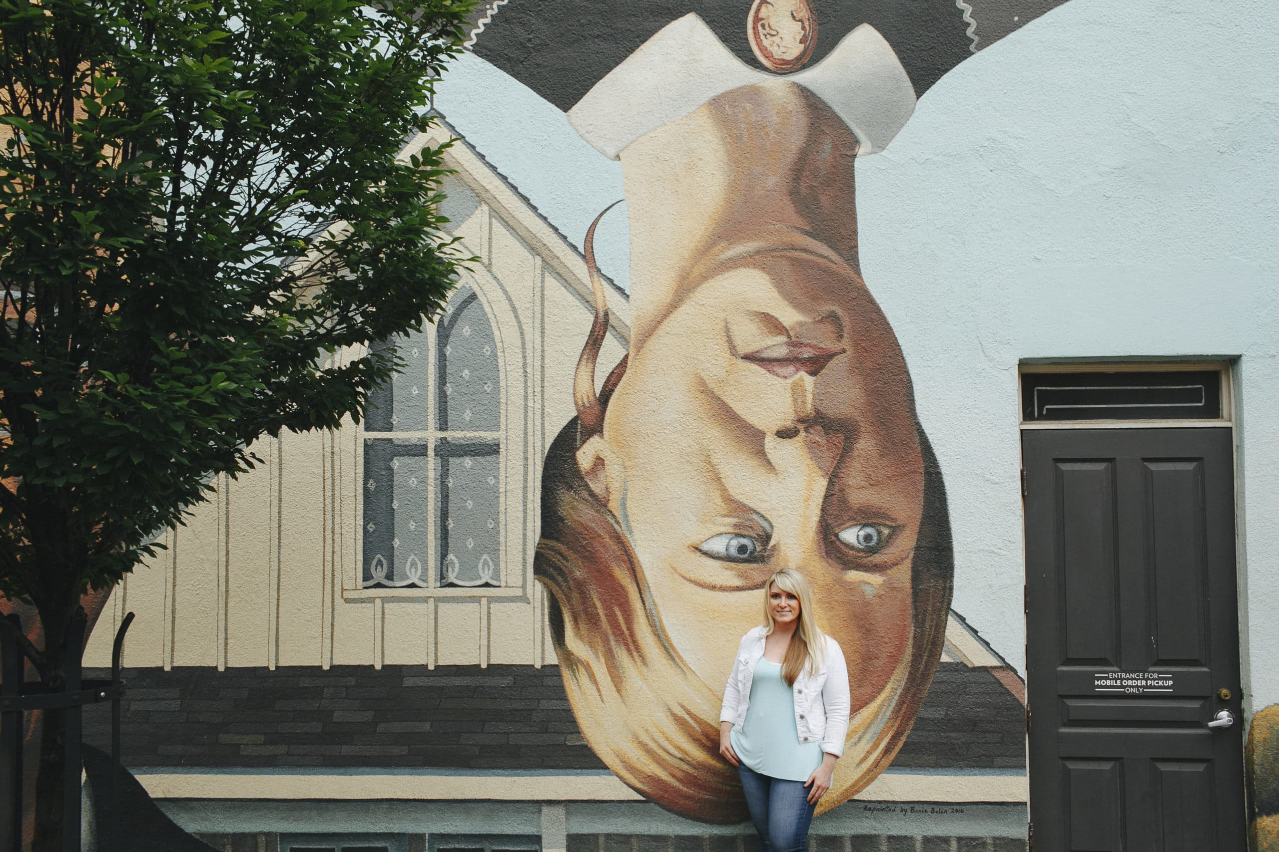
I also brought a couple different “outfits” which for me was just a change of my favorite item of clothing – outerwear!! I chose something that I felt really comfortable in and that aligned with my brand. I wanted to look like me!
My photographer also suggested that I bring a friend along so that he could create images of me doing a client consultation.
And even though I don’t actually do in-person consultations, I think it was such a great idea to have a friend with me – it made the photoshoot more comfortable, and when we are authentically laughing together my real personality comes out – it’s not fake or forced.
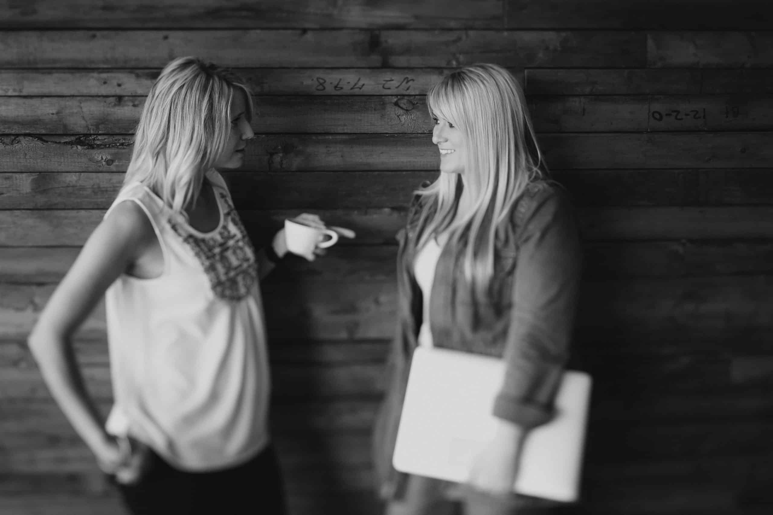
Our shoot took about two hours in total, and it was so much fun!! The photos came out amazing, and I love all of them!
What I'd change next time
THE LOCATION
Even though the Short North is a vibrant, cool place in Columbus, I didn’t get enough shots with neutral backgrounds that matched the branding of my website.
MORE NEUTRAL BACKGROUNDS
Mission Coffee has orangish wood and red brick which clashes with my brand colors.
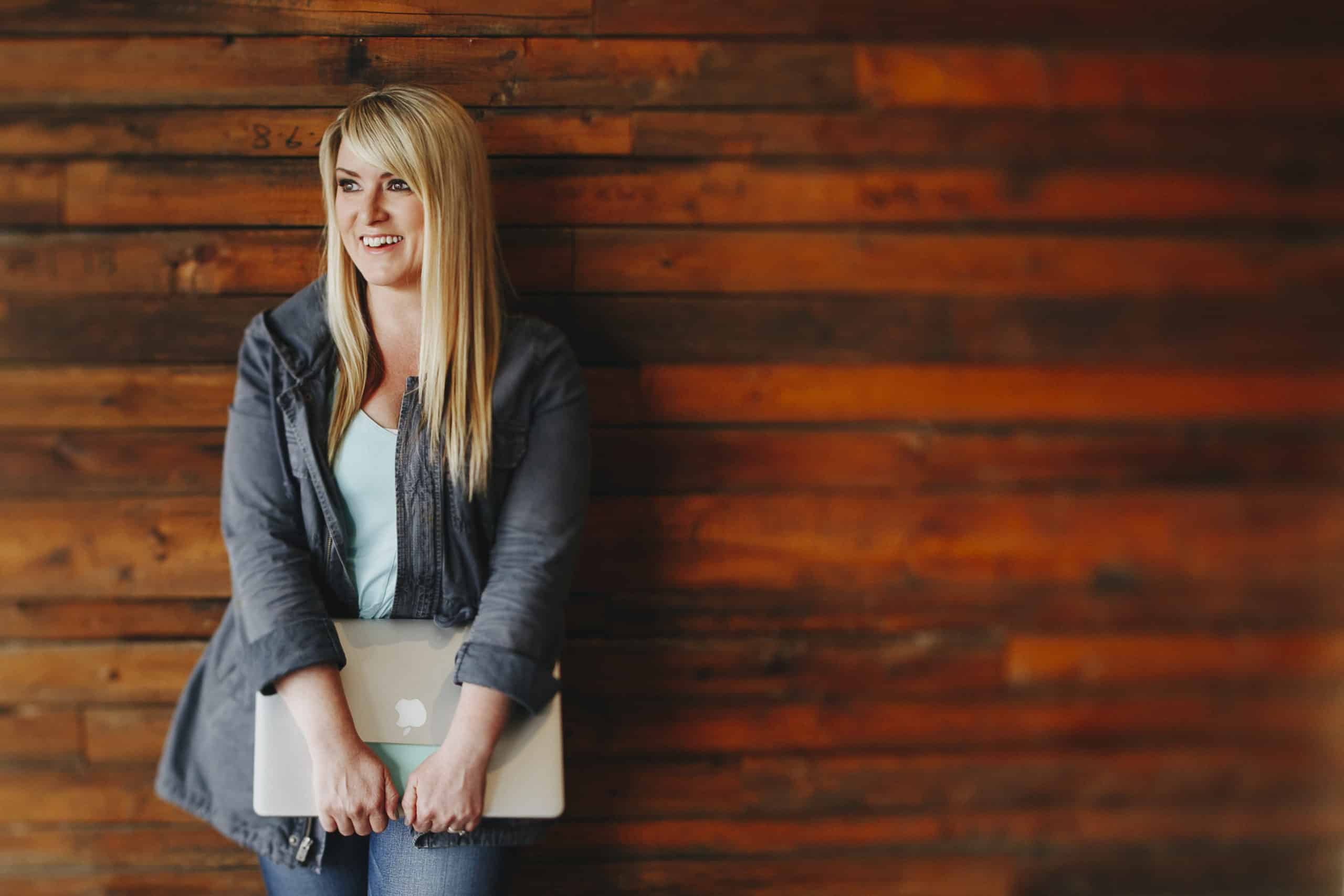
MORE PLAIN OR OUT OF FOCUS BACKGROUNDS
The other interesting backgrounds we chose had too much going on for me to easily overlay text on them. (I can tell my smile muscles are hurting by this point in the photo shoot LOL!)
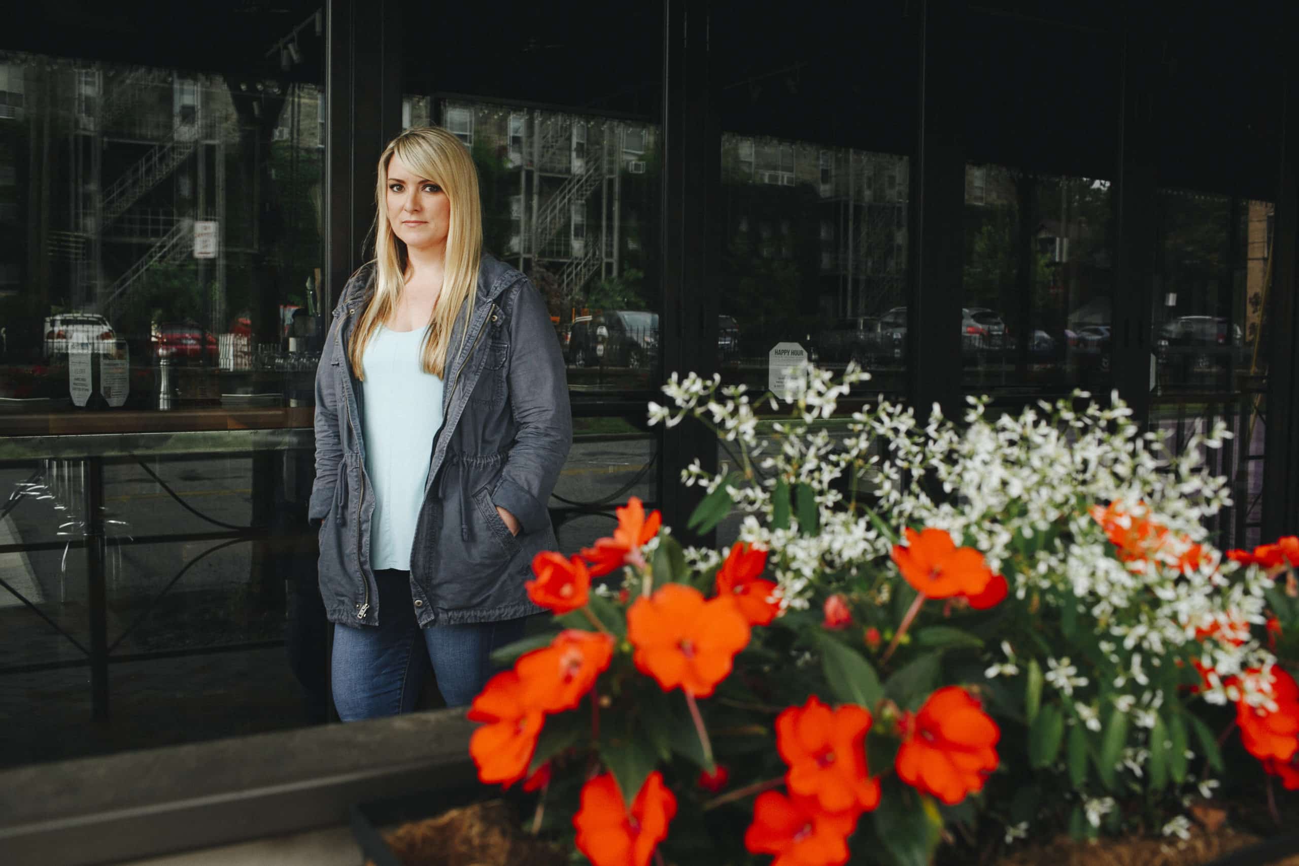
NO BLACK & WHITE PHOTOS
While I love these photos, they just don’t look good on my website. They're too dark.
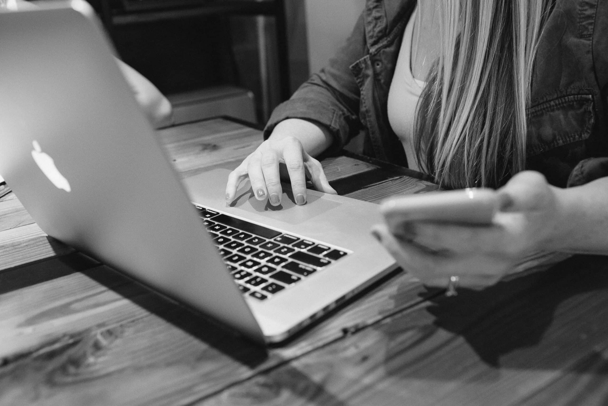
PLANNING
Next time, instead of just winging it and ending up with a lot of amazing photos that I couldn't use on my website or social media, I would have been more strategic about what I needed and created a pre-planned shot list.
Interestingly, I had an impromptu photo shoot while at the Thrive Creative Conference in Austin, TX. As a speaker, part of my package was a professional headshot from Shaylyn Nelson – which I didn’t even know was happening!
I just so happened to be inspired by all the super-cute styles of all the bloggers at Thrive, so that morning I watched a YouTube tutorial on creating a top-knot and spent way too much time trying to figure it out (but I think I totally rocked it), and then right after the conference was over, I was summoned outside for my photo shoot!
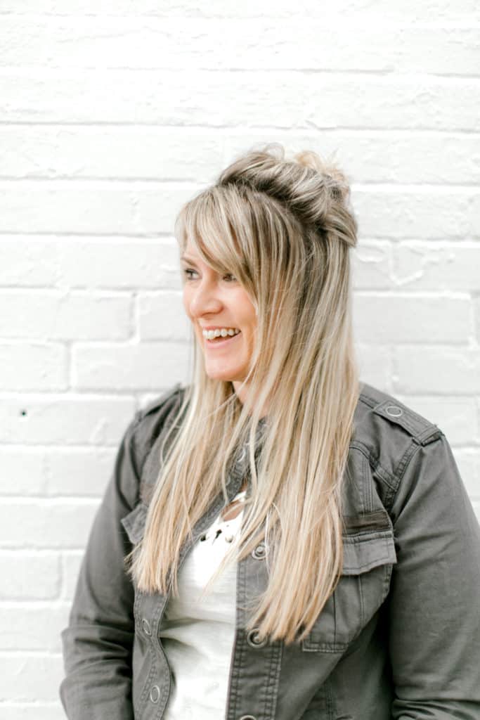 When my turn came up, I totally pretended to be a model in a photo shoot, Shaylyn snapped like 5 or 10 photos in like 30 seconds of me just joking around and cracking myself up, and then I left and didn’t think another thing of it!
About a month later, I get the photos in my inbox and I was like, “OMG, I have to put these on my website NOW, they are perfect!”
I’m on a neutral background that has some texture, the photos are light (rather than the dark ones that I have), there’s one of me looking at the camera, another of me looking away, and I’m being totally real.
I was able to Photoshop the brick wall to repeat across a wide banner so I could use them on my website.
And I didn’t realize how much not having the RIGHT photos, even though I have gorgeous photos, they were was limiting me in my design and branding.
Planning for your photoshoot
HOW TO CHOOSE THE RIGHT PHOTOGRAPHER
It’s important to choose the right photographer, and also make sure they are framing shots that will work well for the layout of your website – plus all of your other online marketing strategies.
If you’re a blogger, and kind of coach (business, health, life), creative entrepreneur (web or graphic designer, copywriter, virtual assistant) or any kind of service provider where you are part of the brand, I recommend that you choose a photographer than offers “editorial” or “photo narrative” photography.
Chelsea Francis, an Austin, Texas-based photographer, specializes in editorial photography. Her photos tell a story and showcase her subjects’ unique brand and personality.
Check out Chelsea’s website for what an editorial-style photo looks like.
As a web designer, I love that her photos are well-lit and candid (and she doesn’t know it yet but I’m hoping take a mini-vacay to Austin and book a shoot with her)!
How can you find an editorial photographer in your city?
Google it! Simply search “editorial photographer ” and you’ll get lots of results. See what resonates with you.
Instagram is also a great place to look – search hashtags for your city like #columbusphotographer or #austinphotographer
Pinterest is another great place to search – simply search for photographer and see what comes up!
If you're willing to travel (or pay a photographer to travel to you), you can look at entrepreneurial website where you love the photography – and then just reach out to find out who the photographer is!
You can also schedule a photo shoot while on vacation! If you pre-plan, you can book a shoot with a local photographer and get some shots beautiful shots for your website (and for your scrapbook)!
What types of photos to ask for
WIDE ASPECT RATIO
You want to have lots of photos that are wider than they are tall so that you can use them on your website as banners or backgrounds.
Your website is landscape orientation, and the majority of the photos you get should also be landscape orientation. You can always crop a landscape photo, but it’s more difficult to widen a portrait-style photo.
How Many?
It depends on your package with your photography, but the majority of your photos should be wider than they are tall for maximum website usage.
PHOTOS WITH YOU ON THE LEFT/RIGHT WITH A NEUTRAL BACKGROUND
Rebecca Tracey of the Uncaged Life does this really well – and so does my Austin photo shoot.
Amy Porterfield also does this really well by having a neutral background that is out of focus instead of literally being neutral.
A neutral background lets your web designer easily overlay text on your photos to create banners and hero images for your website.
How Many?
At least five to seven photos with you on the right or left with a neutral background would be ideal for your web designer to create different banners for your main website pages.
NEUTRAL OR ON-BRAND BACKGROUNDS
Be sure the background in your photos are either neutral or won’t clash with your brand colors.
CANDIDS
Candid photos are those where you’re not actually posing and a moment in time is captured. Candid photos that are planned (not posed) that show your personality and your workspace are great to use on your website!
Again, Becca’s got a great shot of her and her dog on her homepage that was probably planned, but not posed – it shows you that she’s a casual, laid back dog lover and totally makes you want to hang out with her, right??
Amy Porterfield has a shot of her pouring a glass of champagne, and a shot of her recording a podcast episode. Again, it makes you feel like you know Amy on a more personal level, and you can immediately see her expertise.
How Many?
You’ll want to get several candid photos where you’re looking at the camera, and several where you’re not looking at the camera.
Photos where you’re looking at the camera help you to build trust with your website visitors, and photos where you’re not looking at the camera but also aren’t posed show authenticity, which also builds trust!
POSED PORTRAITS THAT AREN'T HEADSHOTS
Check out Chelsea’s website for examples of these types of portraits- there are several images where the subject is posing, looking at the camera and most of their body is showing.
These are great because they can always be cropped into headshots – and when you have the full shot you have lots of cropping options to fill empty spaces on your website.
How Many?
You don't need a ton of these for your website, but it's good to have a few to choose from for your social profiles, guest blog posts and other scenarios where you'll need to send someone a headshot.
PHOTOS OF YOU POINTING AT SOMETHING
These are optional, and they would be used for emphasizing calls to action on your website or on social media.
I personally didn’t ask for these because I don’t feel like they really fit my personality and they don’t feel authentic to me.
I’ve seen them look super cheesy for some people, and others look really good! Do what feels best and most authentic to you and your brand.
How Many?
One for each direction!
- You pointing and looking down at a message below you.
- You pointing and looking up at a message above you.
- You pointing and looking right at a message to the right of you.
- You pointing left and looking at a message to the left of you.
PHOTOS WITHOUT YOU IN THEM
These are also optional.
If your brand has a certain aesthetic and your photographer is willing, you may want to get several shots that you can use as textured backgrounds for graphics, or maybe of objects that align with your brand like your office space, your kitchen if you're a food blogger, your closet if you're a fashion blogger, your fave yoga studio studio if you're a health coach – you get the idea!
How Many?
No limit!
How to have a great photo shoot for your website
BE YOURSELF
I recommend that you dress in something that's YOU.
Sure, I wear yoga pants on the daily and I'm not getting a photoshoot done in them, but I'm also not gonna wear a fancy dress and heels and look like a total fabulous #girlboss because that's not me either! Jeans a t-shirt for this girl – but I'm still gonna look cute and put together like I'm going out with my friends.
If bold lipstick is YOU, then go for it. If it's not you, don't force it. If you never accessorize, don't feel like you have to today just because it's your photoshoot.
If you don't feel comfortable, your photos may lack authenticity.
BRING A FRIEND
Invite that friend that always cracks you up and makes you feel confident. Maybe that's your partner or a coworker. Invite them along, it will bring out YOU in your photos.
INJECT YOUR PERSONALITY
How can you show a little “behind the scenes” in your photos? Maybe it's a room in your house, your dog, your actual office space. Your favorite hangout spot, your partner. Show your personality in your photos – it helps people feel more connected to you!
Final thoughts
The last thing I'll leave you with is to plan enough time for your photoshoot. Ask your photographer when you can expect to receive the final photos, and then make sure that your web designer has accounted for that time in their project schedule.
Also, share this blog post with both your web designer and your photographer and ask them if there's anything they would add or change. When you're hiring experienced professionals take advantage of their knowledge and advice!
What's your opinion?
Have you ever had a professional photo shoot done? What would you do differently (or do again)?
If you're a photographer and have anything to add to this post, please share in the comments below – I'd love to hear from you!
